Posts in the category "Computer & Gadgets" and its subcategories.

I like computers. I might even call myself a nerd among normal people (among real nerds, I’d be a laughing-stock). Some people name their cars, I’ve named my computers.

Fine line between gamer and crazy

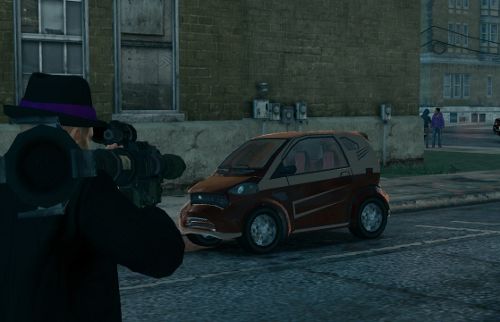
It happened again: I’m walking home and see one of those cute compact cars drive by. My first thought is “Oh, oh! Where’s my rocket launcher?!”

“What?!” you may ask.

See, I’ve been playing this game, Saints Row the Third for quite a long time now and there’s a challenge where you have to destroy 50 Emu cars. I’m on my second round of the game now. The Emu challenge was one of the last ones I finished on the first round — not because it’s difficult but just that everything’s a blur when I’m usually zooming by in a fast sports car — so this time I’m making a conscious effort to keep my eye out for them as I’m moving around Steelport. That way I won’t have to resort to driving one out of my own garage just to blow it up to get the few remaining ones I’m too impatient to search for…

Emu in Saints Row the Third

Kuh, Boom!

It also happened with Saints Row that first I had spent a long time trying to finish a difficult Insurance Fraud where you have to hurt yourself by getting hit by cars for instance, the more extravagant the manner the better. (It doesn’t damage the character.) Once the fraud was at last completed I was still in the accident-seeking frame of mind and started hurling myself at cars in the normal game world. (That did some damage…) No chance of that happening in real life, thankfully.

It’s been a while since I’ve played Portal but I do remember that after having played through some tough Advanced levels where a “portalable” wall was difficult to find, I looked at the narrow bit of white wall between my fridge and bathroom door and thought “hm, that’s a great spot for a portal.”

Should I be worried…? Nah.

Saints Row also has you do 500 headshots (and, ahem, 25 nutshots) but that doesn’t mean I think about doing them when I see other people. That would be just… crazy.

Thumb workout

A while ago, on January 22 to be exact, I noticed how my thumbs looked very scrawny compared to my other fingers. I mean, I do type a lot on my mobile but on the computer all they get to press is the spacebar and occasionally some buttons on the mouse and touchpad. (In this day and age, what else is there for thumbs to do?)

I had to do something — stat!

The only cure I could think of was an Xbox 360, so I had to buy one of those. For thumbs’ sake. I got a 250GB one bundled with Kinect. The only game that came with it is the Kinect Adventures which means no controller to use (duh). For first-aid I ordered Alan Wake from an online store but it wasn’t going to arrive in the mail soon enough; I had to go shopping some more and ended up getting Dragon Age, and Condemned after it was recommended to me by the guy in the little game store I went to. (I got recommended a horror game — excellent! If he’d suggested Sims, I would’ve punched him in the face.)

Dragon Age (pretty easy-going) and Kinect Adventures (no controller, besides myself) have been getting the most TV time so far, but when I played Alan Wake I could really feel the exercise affecting. I better keep at it!

Layout hall of shame

Pull up a chair, or a recliner, this is going to be a long story. In a nutshell: new theme! In case you didn’t notice.


At last, a new theme for the blog! How I’ve missed the CSS and HTML tweaking! I haven’t worked on a layout in ages.

“Ages” also meant that I needed to brush up my knowledge and the code needed to be updated (HTML, CSS, as well as WP functions). And so started the process which I was determined to finish this time — from scratch: 1) created empty text files style.css, index.php, header.php, footer.php, sidebar.php, and functions.php. 2) typed <html><head></head><body> in the header.php and </body></html> in the footer.php.

Then I started digging through the WordPress Codex because I couldn’t remember the template tags — and, naturally, a lot had changed: functions were deprecated and nice new features were available, such as threaded comments and fancier image handling.

I also updated some of the code to HTML5 since the HTML validator noticed deprecated elements. I like using W3Schools as my HTML/CSS reference. For instance, <acronym> tag is now deprecated in favour of abbr and I wanted to clear all those out. Why did I use acronym, which needs more typing than abbr, to begin with, I have no idea…

As you may notice from my earlier post, I ended up using the nice (in my opinion) photo of my shirt collar and smiley pin that I had as a header in one of the unfinished themes. Even though I’m really bad at graphic design (or anything resembling it), I wanted some pictures in the layout.

The theme is by no means finished. I still have some tweaking and prettifying to do, but I wanted to publish this at last. It’s going to look weird for a while as I set up the widgets and things. I’m also going to browse my old posts to check which elements I’ve forgotten to style but hopefully everything looks more or less ok. I noticed I need to do some markup streamlining especially on my pages. (The headers are not logically tagged.)

While I was looking for some inspiration from my unfinished themes, I stumbled across files from my old layouts as well as pictures of some really old ones. I thought I’d put up a little Hall of Shame in honour of this historical day.

I got acquainted with HTML in an optional computer course (some pupils did crafts or PE; I was one of the few girls who chose computers) in junior high where we were taught to indent paragraphs with <li> tags. No, no <ul> or <ol> around it because that would’ve made an ugly bullet. Just the <li> with text. (I’m banging my forehead to the desk now.)

I would be curious to see how my HTML pages looked back then as I have no recollection. (Maybe I have something stored on a 3.5″ somewhere.) I do remember that I realised our teacher was bad, which led me to pick up a Microsoft Frontpage guidebook from a bargain bin. I didn’t buy it because of Frontpage which I did happen to have installed on a computer at some point and I actually used it sometimes, but because it was a basic guide to HTML (must’ve been HTML 3) with clear illustrations. And it knew about <blockquote>.

I don’t remember what I did (HTML- or otherwise) between junior high (~1998) and the first “blog” (~2004) but I do have a vague memory of a very simple homepage that I had in the small website space that came with the Internet connection. I believe the X-Files site was my first proper site. I don’t have it up at the moment because it got stuck in the middle of a re-design that I managed to destroy by uninstalling XAMPP. (Oh, the hours I had spent on making it!) The X-Files has been off the air for 8 years so maybe I won’t put the site up anymore. Not that I don’t love the show as much as I did; the collection part of that hobby of mine could easily be made into a new sub site.

My “blog” started as a launchpad for my different sites (about the X-Files, Stephen King, my alien and font collections etc.). I wasn’t even blogging, as such, only wrote a little about the updates and maybe about music I was listening to and things like that as a side note. Because it wasn’t blogging, I have no log of the status updates and asides; they could’ve been interesting to read (just for myself, that is).

I really liked iframes back then — and I still have them in Little Grey Men which I haven’t updated for a long time because I haven’t found any new alien items anywhere! I also liked image maps which I used in the first two menus seen below. Since I didn’t have much to say on my front page, this first one was probably just a simple table (gasp!) layout. I don’t think I knew any other way to align the content both horizontally and vertically in the browser window than put a table inside a table (contents of table cells could be aligned vertically). I did this in all of the first three layouts (even though you can’t see it in the pictures); the layout part of the site was small to accommodate 600×480 screens :D. I could say divs hadn’t been invented yet back then but I would be lying. I do honestly believe that I hadn’t discovered div’s yet and I didn’t know much about CSS — although just now I noticed that I was using style sheets already with this first layout. I’m quite surprised. (Then again, the very first layout(s) of which I have no record were most likely plain HTML with e.g. font styling in <font> tags, remember those? So, I had had practise.)
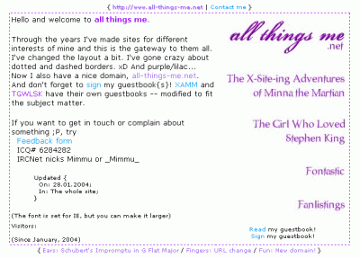
October '03 to January '04

Next came a brown theme with colours picked directly from HTML’s named colours (tan, steel blue, and antique white). I called this “Cafe Latte”.
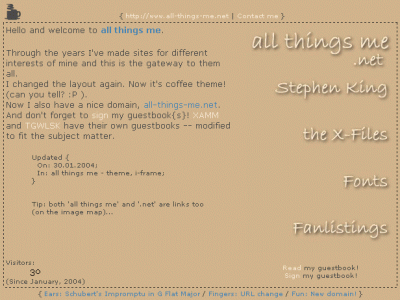
January '04 to March '04

I had fewer elements to style then and therefore creating new layouts was faster (and I had more time and energy!), so this layout stayed up for only 3 months.

For some strange reason I kept using blue in my layouts even though I’ve never liked blue! (The “steel blue” is pretty nice, though.) The next one was based on a photo I’d taken at our summer cottage and now it did have an iframe plus a transparent scrollbar (available on IE only). This one survived for only 3 months, too… Here’s “From Dusk till Dawn”:
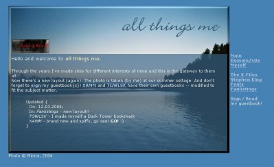
March '04 to May '04

At this point, around March ’04 I’d started writing longer entries instead of just update notices and so I started looking into different blogging platforms. My website was hosted in someone else’s (then known as Shirasade) domain for free and I think I couldn’t use MySQL for instance. I figured I wouldn’t be writing so much anyway and kept on “blogging” with plain ol’ Notepad and an FTP client. Or as I called it, “powered by coffee and noodles.”

I really like this next one, called “Scribble”. It featured some fancy underlining (whilst making a new design for my King site I’d discovered a way to do underlines with graphics) and an animated UFO in the header!
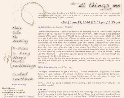
May '04 to June '04

Finally something pushed me over the edge and I decided to start using a blogging platform. I began with Greymatter and created a new layout, “Swirly”, for it (I’m shocked by the colour scheme, I didn’t remember this one!):
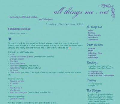
June '04 to September '04

(The screenshot is from the WordPress version because I didn’t have a picture of this layout. Luckily I had backups of the files so I installed WP1.2 on XAMPP and took a picture.)

Greymatter was soon replaced by WordPress because I started getting tired of the constant rebuilding of static pages.

I modified this to WordPress’s layout system when I started using WP in July 2004 (at a time just before templates and themes); WP was in version 1.2 back then. I kept the layout for a whole 4 months in total. I had used a drop shadow in most images, so they had the green background colour for a cleaner look. It was such fun to modify them to the next layout which had bright purple background instead:
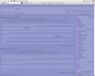
September '04 to August '10

And now. Finally, after nearly 6 years I can present a new layout. To my defense, I haven’t been on a complete coding hiatus all this time because I’ve created several layouts for my “sub sites” (X-Files, Stephen King, alien collection, Ami (the dog), fonts…). And I also have been close to releasing new themes before. Apparently I had been nearly done with a design in 2005, only 7 months after releasing the purple one. I’d actually planned on finishing it in 2007 but never did. It must’ve been the design I’d created for my course work because I can remember fighting with some silly pixels — I just couldn’t get the building blocks looking the same (or at least similar enough) across browsers. It probably was structurally too complicated. Now that I look back at the design, I’m glad I didn’t finish it. The colours are… sheesh. Way too bright.

Without further ado (especially since there’s been plenty already), I present: “Not So Serious” (no reference to Batman intended). Dedicated to my late socks.

(Funnily, the colour scheme matches those boots… At the beginning of my vacation, I took a backup of the site to use as a sandbox on a local installation of WordPress and the boot post was the newest one then.)

Hope you like it! I think I do. At least it’s a change from the purple.
Pretending to be a designer again

This must be at least the fourth time I’m starting to code a new blog theme. I’m not sure how long I’ve had this layout — +3 years in any case. (Can it be 6 years? An internet archive site showed this layout in a stored page from 2004… Whoooboy, high time then.)

First I started making a theme based on the blogging application I did for a University course.

Snippet of a portfolio layout for uni

Then I wanted to do something red…
A layout sketch

Next I started creating something around a nice photo of mine…
Collar with a smiley pin
(The pin is from my sister and I often wear it on my winter coat.)

Now I’m creating a theme around this colour palette I created at Colourlovers.com when I was planning the colour scheme for my apartment (back in 2007, sheesh).

I’m feeling this time I’m actually going to finish it. Thankfully, I have 2 more weeks of vacation left! The creation process is always very difficult for me because I can’t doodle, draw, or design the graphics, AT ALL.

Assassin’s Greed

Must. Find. All. Flags.

In Assassin’s Creed you find different flags all around the world and cities.

There are

  • 100 King Richard flags
  • 100 Saracen flags
  • 100 Jerusalem flags
  • 34 Templar flags
  • 33 Hospitaler flags
  • 33 Teutonic flags
  • 20 Assassins flags

That’s 420. That’s a lot of flags.

And of course, I have a huuuge temptation to try and find them all. Because, I just like collectables.

There are also 60 Templars to (find and) kill…

Finish one before you start another

I have to start following a game decluttering policy: finish one game before you start another.

The reason I’m thinking about this is that I bought Spore on Saturday and now I’m itching to install it. Luckily I have the patience to wait for the price to drop on the newest Splinter Cell until at least this Christmas because I haven’t even finished Double Agent yet.

There are so many games I’m “currently playing”:

  • Tomb Raider: Underworld
  • Indiana Jones: Emperor’s Tomb
  • The Chronicles of Riddick: Assault on Dark Athena
  • Fallout 3

And loads more I have installed on my old computer (Fear, Half-Life 2 episode 2, Fable, Splinter Cell Double Agent (which I’m going to install on the new computer and start over), Morrowind) and some I cannot even remember.

Thankfully, I finished Prince of Persia and Lego Indiana Jones a while ago. I still have well-hidden treasure chests to find in Lego Indiana Jones so I haven’t got it 100% finished yet. Also, TR: Underworld is advancing nicely now once I got past some monsters that killed me and my motivation in January (hey, I was completely out of medikits!). Thank you, vacation.

I better get at it, this is my last day off!

One keyboard, mouse, and monitor to rule them both

Ever since I got my new computer my old one has been understandably neglected. It’s been such a hassle crawling under the table to switch the monitor cable back and forth that I’ve just left it be. (I do have 2 keyboards and 2 mice but not really space on the desk for all 4 peripherals.) At least I have an access to the files on my old computer so I’ve been able to move what I want over, but I still want to keep on playing with old I went to pick up the switch last night — after an hour of queuing — and picked up a fresh Nokia battery and Chronicles of Riddick Dark Athena while I was waiting.

This morning I hooked it up. The guide says to turn off all power from the computers, hook everything up and then turn on the computer(s). Well, I did that and nothing worked. I figured it was the same situation as when I’d hooked up my special keyboard and mouse for my very first start-up of the new computer — and the screen kept being black, and nothing lighted up on the keyboard and mouse. So, I plugged my keyboard, mouse, and screen directly to the computer and surfed to Aten’s site to look for a driver. None available. Isn’t this nice.

I read the manual a bit further and it mentions a hot-key for quickly switching between the ports (2 x Scroll Lock). I put everything back again (except for the screen), and pressed Scroll Lock twice. Lo and behold. It made the lovely little chime and started installing a driver. Phew.

I suppose pressing the Scroll Lock would’ve worked the first time around (without having to plug in the switch while the computer was running) but it was actually supposed to detect the computer that turns on first and switch to using that port. Oh well. Now it’s working and after adjusting the resolution back to 1280×1024 everything seems to look the same as before.

Welcome back Sullivan! (I haven’t tried this on it yet, though.)

Meet Angus

Angus

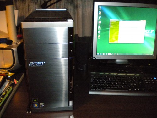
Hello, my name is Angus. I’m an Aspire-ing entertainment centre. I enjoy FPSs, surfing, and occasionally wearing a skirt. I have a handsome brushed steel exterior and my innermost core is Phenomenal, if I may say so myself. I’m a bit of a softie (Win7 variety) but you better be on good terms with me since I never forget anything — everything’s stored in my gigantic memory and hard disk. (Technically, “giga” is too small a word to describe the disk, but I don’t want to brag.)

The first start-up was interesting — in addition to having a mild heart attack when the screen (my old one) wouldn’t work. I plugged out all extra peripherals, plugged in the mouse and the keyboard that came with the computer, and restarted a 2nd time. Thankfully, this time it worked!

I decided to go with Finnish Windows although I’m very comfortable with English. I may regret this later since it’s, of course, easier to look for info and help online when you know the English application names, menu options etc. During the first steps, one of the buttons was incorrectly labeled in French (Suivant, I suppose that’s “Next”). Tsk tsk. Who’s in charge of the localisations? It may’ve been Acer’s dialogue, actually, and not Windows. Having briefly visited Acer’s Finnish website, I think that’s exactly the case. The translation there is horrific.

There is a mysterious hidden compartment on top of the computer. It’s slightly bigger than a CD. I don’t know for what I’m supposed to use it but since I’m currently making a recovery DVD (requires 3), I may stash those in there. Luckily 3 DVDs were included in the package. (Sure, I have stacks of DVDs but it’s nice that they were considerate.)

Even the texts in this recovery disk program sound strange: “Tarkastamassa taustakuvaa”. Checking background image? Why would it do that? Maybe it’s supposed to mean “background checking image” (disk image). I have no idea.

This is a nicely silent computer. My previous ones (both Fujitsu Siemens) have been quite noisy. Possibly due to collected dust, and maybe even the power supply is to blame (Dad mentioned that my older computer (Simon) got better when they swapped the power supply. Good thing, too, that this is silent since I’m planning on keeping it on the desk instead of under.

(OK, I’m already regretting my language choice. Still, I’m convinced all the bad language is thanks to Acer, not Microsoft.)

Can’t decide whether I should start thinking about the migration right away or install Tomb Raider Underworld…

All work and no play makes Minna a dull girl…? I think I better check that TR:U installs properly since that’s the reason I got this machine. ;) (Well, not exactly but it certainly accelerated the decision.)

Choices choices

I have a huuuge dilemma: I’m trying to decide which Nokia device to get next and I just can’t make up my mind this time!

There is the N97, the N900 (not available just yet), XpressMusic 5800 (getting kinda old ;) ), and the upcoming X6 (no idea when it’s coming out), that have all caught my interest. And who knows about what’s coming out soon!

I would choose the N900 in a heartbeat because I’m very curious about Maemo, if only it had a radio and a multimedia message feature. (I don’t use either of them very much but they’d be useful to have.) The 5800 is the first touch screen device, released quite a while ago, so I figure the newer ones should have improved technology — and it has only a 3.2 megapixel camera which is what I have now in my 3-year-old phone (!). I think N97 would be my number one choice right now, but N900 is too close a second.

I must make up my mind though, since all these devices are around 600 euros each… (If I was rich I’d get the N900 and wait around for a bit to see if something amazing comes along and if not, get the N97.)

Now we’re talkin’

I bought a new USB stick (8GB) for making a bootable stick for Ubuntu Netbook Remix. I tried following different instructions to create it with the Linux’s “dd” command. First it reported errors in data transfer, then after Kory’s help it transferred properly but I was faced with a non-effective bootable stick. I chose to boot off it but it just went right through to the normal boot-up. Gah.

(At this point, I managed to bork something bad enough that I ended up making a recovery stick for the original AA1 Linpus and installed it again. Because this worked, I trusted the problem was not with the stick as such but the creation of the bootable image.)

Today I decided to try it on Windows — and it worked! (trusty Windows ;) )

Not that there was anything really wrong with Linpus (except that I couldn’t install a Pidgin version new enough to support ICQ and updating Firefox would’ve been such a hassle), but there’s something irksome about the super-simplified interface.

Now THIS looks like a proper computer OS:

Haven’t played much on it yet. I’m now retiring to the sofa to do just that.

[edit 8/3/2009] Here’s a sceenshot :)

[/edit]