Translator’s amnesia
I’m waiting for an email from the library so I changed the address in my library information to my mobile email. I also set up the phone to check mail every hour (not in the middle of the night). I use the Finnish user interface and this, not surprisingly, caught my eye:

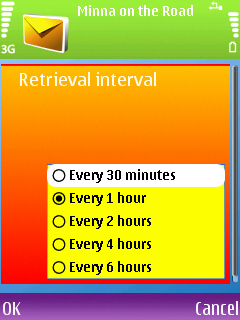
First of all, it’s funny how it says “30 minuutin väl.” instead of “30 minuutin välein” even though there’s quite a bit of empty space… (This isn’t by far the worst case I’ve seen. I’ll show you a bad one if you’re interested ![]() ) but the 4th item makes you miss a few heartbeats (no? Is it just me?). How did that happen? When you look at the English options, they are nice and consistent:
) but the 4th item makes you miss a few heartbeats (no? Is it just me?). How did that happen? When you look at the English options, they are nice and consistent:

I envy you who use the English UI! ![]() (I know I could use it too, but Finnish feels somewhat more comfortable — despite things like these.)
(I know I could use it too, but Finnish feels somewhat more comfortable — despite things like these.)
[Edit: Dec 6th]
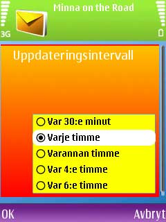
By popular demand ![]() Here’s the Swedish UI
Here’s the Swedish UI

It looks cool, though.
Strange. Maybe when they were doing the translations, the font size was a bit bigger or it was a fixed-width font. But then the fourth item… wow. And from a Finnish company.
How’s the Swedish UI?
I updated the post to show the Swedish UI. It is somewhat more consistent than the Finnish one (the Finnish “Joka 4. tunti” reeks of an involuntary mistake). I can’t think of a different way to say “Varje timme” but “varannan” could be written more eloquently (I’d think… I don’t remember!).