Layout hall of shame
Pull up a chair, or a recliner, this is going to be a long story. In a nutshell: new theme! In case you didn’t notice.
At last, a new theme for the blog! How I’ve missed the CSS and HTML tweaking! I haven’t worked on a layout in ages.
“Ages” also meant that I needed to brush up my knowledge and the code needed to be updated (HTML, CSS, as well as WP functions). And so started the process which I was determined to finish this time — from scratch: 1) created empty text files style.css, index.php, header.php, footer.php, sidebar.php, and functions.php. 2) typed <html><head></head><body> in the header.php and </body></html> in the footer.php.
Then I started digging through the WordPress Codex because I couldn’t remember the template tags — and, naturally, a lot had changed: functions were deprecated and nice new features were available, such as threaded comments and fancier image handling.
I also updated some of the code to HTML5 since the HTML validator noticed deprecated elements. I like using W3Schools as my HTML/CSS reference. For instance, <acronym> tag is now deprecated in favour of abbr and I wanted to clear all those out. Why did I use acronym, which needs more typing than abbr, to begin with, I have no idea…
As you may notice from my earlier post, I ended up using the nice (in my opinion) photo of my shirt collar and smiley pin that I had as a header in one of the unfinished themes. Even though I’m really bad at graphic design (or anything resembling it), I wanted some pictures in the layout.
The theme is by no means finished. I still have some tweaking and prettifying to do, but I wanted to publish this at last. It’s going to look weird for a while as I set up the widgets and things. I’m also going to browse my old posts to check which elements I’ve forgotten to style but hopefully everything looks more or less ok. I noticed I need to do some markup streamlining especially on my pages. (The headers are not logically tagged.)
While I was looking for some inspiration from my unfinished themes, I stumbled across files from my old layouts as well as pictures of some really old ones. I thought I’d put up a little Hall of Shame in honour of this historical day.
I got acquainted with HTML in an optional computer course (some pupils did crafts or PE; I was one of the few girls who chose computers) in junior high where we were taught to indent paragraphs with <li> tags. No, no <ul> or <ol> around it because that would’ve made an ugly bullet. Just the <li> with text. (I’m banging my forehead to the desk now.)
I would be curious to see how my HTML pages looked back then as I have no recollection. (Maybe I have something stored on a 3.5″ somewhere.) I do remember that I realised our teacher was bad, which led me to pick up a Microsoft Frontpage guidebook from a bargain bin. I didn’t buy it because of Frontpage which I did happen to have installed on a computer at some point and I actually used it sometimes, but because it was a basic guide to HTML (must’ve been HTML 3) with clear illustrations. And it knew about <blockquote>.
I don’t remember what I did (HTML- or otherwise) between junior high (~1998) and the first “blog” (~2004) but I do have a vague memory of a very simple homepage that I had in the small website space that came with the Internet connection. I believe the X-Files site was my first proper site. I don’t have it up at the moment because it got stuck in the middle of a re-design that I managed to destroy by uninstalling XAMPP. (Oh, the hours I had spent on making it!) The X-Files has been off the air for 8 years so maybe I won’t put the site up anymore. Not that I don’t love the show as much as I did; the collection part of that hobby of mine could easily be made into a new sub site.
My “blog” started as a launchpad for my different sites (about the X-Files, Stephen King, my alien and font collections etc.). I wasn’t even blogging, as such, only wrote a little about the updates and maybe about music I was listening to and things like that as a side note. Because it wasn’t blogging, I have no log of the status updates and asides; they could’ve been interesting to read (just for myself, that is).
I really liked iframes back then — and I still have them in Little Grey Men which I haven’t updated for a long time because I haven’t found any new alien items anywhere! I also liked image maps which I used in the first two menus seen below. Since I didn’t have much to say on my front page, this first one was probably just a simple table (gasp!) layout. I don’t think I knew any other way to align the content both horizontally and vertically in the browser window than put a table inside a table (contents of table cells could be aligned vertically). I did this in all of the first three layouts (even though you can’t see it in the pictures); the layout part of the site was small to accommodate 600×480 screens :D. I could say divs hadn’t been invented yet back then but I would be lying. I do honestly believe that I hadn’t discovered div’s yet and I didn’t know much about CSS — although just now I noticed that I was using style sheets already with this first layout. I’m quite surprised. (Then again, the very first layout(s) of which I have no record were most likely plain HTML with e.g. font styling in <font> tags, remember those? So, I had had practise.)
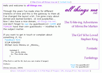
October '03 to January '04
Next came a brown theme with colours picked directly from HTML’s named colours (tan, steel blue, and antique white). I called this “Cafe Latte”.
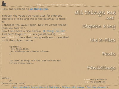
January '04 to March '04
I had fewer elements to style then and therefore creating new layouts was faster (and I had more time and energy!), so this layout stayed up for only 3 months.
For some strange reason I kept using blue in my layouts even though I’ve never liked blue! (The “steel blue” is pretty nice, though.) The next one was based on a photo I’d taken at our summer cottage and now it did have an iframe plus a transparent scrollbar (available on IE only). This one survived for only 3 months, too… Here’s “From Dusk till Dawn”:
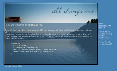
March '04 to May '04
At this point, around March ’04 I’d started writing longer entries instead of just update notices and so I started looking into different blogging platforms. My website was hosted in someone else’s (then known as Shirasade) domain for free and I think I couldn’t use MySQL for instance. I figured I wouldn’t be writing so much anyway and kept on “blogging” with plain ol’ Notepad and an FTP client. Or as I called it, “powered by coffee and noodles.”
I really like this next one, called “Scribble”. It featured some fancy underlining (whilst making a new design for my King site I’d discovered a way to do underlines with graphics) and an animated UFO in the header!
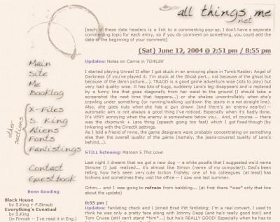
May '04 to June '04
Finally something pushed me over the edge and I decided to start using a blogging platform. I began with Greymatter and created a new layout, “Swirly”, for it (I’m shocked by the colour scheme, I didn’t remember this one!):
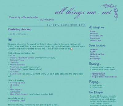
June '04 to September '04
(The screenshot is from the WordPress version because I didn’t have a picture of this layout. Luckily I had backups of the files so I installed WP1.2 on XAMPP and took a picture.)
Greymatter was soon replaced by WordPress because I started getting tired of the constant rebuilding of static pages.
I modified this to WordPress’s layout system when I started using WP in July 2004 (at a time just before templates and themes); WP was in version 1.2 back then. I kept the layout for a whole 4 months in total. I had used a drop shadow in most images, so they had the green background colour for a cleaner look. It was such fun to modify them to the next layout which had bright purple background instead:
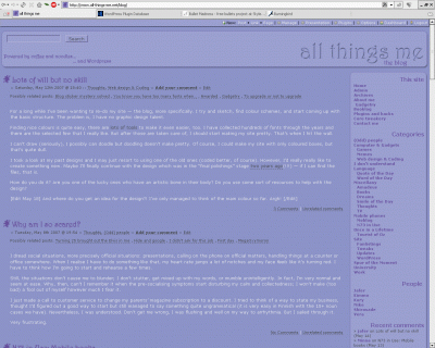
September '04 to August '10
And now. Finally, after nearly 6 years I can present a new layout. To my defense, I haven’t been on a complete coding hiatus all this time because I’ve created several layouts for my “sub sites” (X-Files, Stephen King, alien collection, Ami (the dog), fonts…). And I also have been close to releasing new themes before. Apparently I had been nearly done with a design in 2005, only 7 months after releasing the purple one. I’d actually planned on finishing it in 2007 but never did. It must’ve been the design I’d created for my course work because I can remember fighting with some silly pixels — I just couldn’t get the building blocks looking the same (or at least similar enough) across browsers. It probably was structurally too complicated. Now that I look back at the design, I’m glad I didn’t finish it. The colours are… sheesh. Way too bright.
Without further ado (especially since there’s been plenty already), I present: “Not So Serious” (no reference to Batman intended). Dedicated to my late socks.
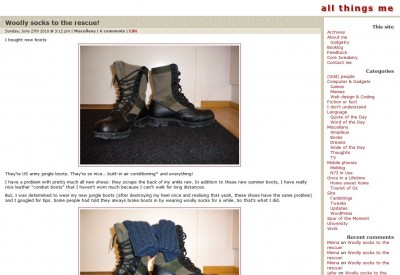
(Funnily, the colour scheme matches those boots… At the beginning of my vacation, I took a backup of the site to use as a sandbox on a local installation of WordPress and the boot post was the newest one then.)
Hope you like it! I think I do. At least it’s a change from the purple.
That’s funny, all those changes, I haven’t strayed too much in the last 5-10 years from my little cartoon, only to have less purple now than what I started out with.
And I first started writing a blog without those blogging tools (it was a pain in the ass updating the html every day). But I then also switched to Grey Matter as my first blogging app, then I went to Movable Type, then on to WordPress.
The rest is history – except, unlike you, I haven’t written my own theme. I’ve thought about it before, I know they have instructions on the php (which I would need), but I haven’t found the time.
So good for you. And congrats on your new shirt theme
Web design would probably be what I’d study if I was artistic. That’s why I like making at least simple themes and trying out new things.
One new thing could be to move the sidebar to the left… but I think on the right it makes more sense.
Yes, for some reason I’ve come to dislike left side bars.
I suppose right sidebar makes more sense (in languages that are read from left to right). The main content should be available first and in a blog the posts are the main content.
If, on the other hand, the first thing visitors do on a site is to navigate somewhere else (e.g. in Wikipedia), it’s good to have the navigation and menus on the left.
Oh the reminiscence! Thanks for this post.. it also made me recall a lot of how things started with me :). Oh how I miss those days – though simple as we know it now, when I first started, I thought it was a little complicated yet fun! I really like this new theme – very simple but has a little fun to it (with the image). I really like how everything is placed :). Keep the sidebar to the right. I’ve been so use to it that way. The evolution of your work is very cool! I still remember the X-files one…I will miss the purple theme – even though I stared at it for a couple years (I think I just might miss the colour! as you can’t really count white or grey a colour?)